Some of you may have already been switched over to Facebook’s new page layout. Some of you may have been switched over only to have Facebook revert you back. Most of us, however, have probably received an invitation located between our admin panel and our cover image like the one below:

If you’re the adventurous type, you went ahead and clicked it and were greeted by this pop-up:
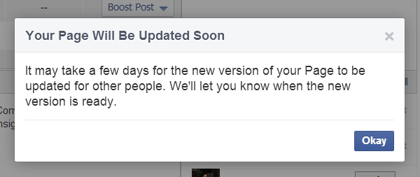
Judging from comments around the web, joining the wait list did not likely lead to your page being updated in a few days. Alas, many of us are still waiting for our new pages.
While we’re waiting, let’s review Facebook’s new business page layout and make sure we’re prepared for what’s to come.
Facebook’s New Page Layout: Streamlining the Look
So why did Facebook switch to the new layout? In a blog post back on March 10 they announced “A Streamlined Look For Pages,” to “make it easier for people to find the information they want and help Page admins find the tools they use most.”
This means a better experience for both page admins and their fans. The less time we spend trying to create or find information on our Facebook pages, the more time we can spend being awesome.
So let’s take a look at the changes and what they mean for you.
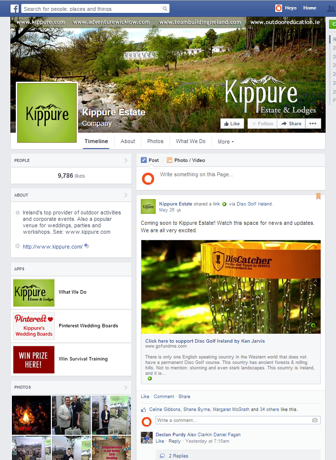
The Timeline
The timeline is going to a single column with equal-sized posts. By doing so, Facebook is creating a more consistent experience for the user who often views Facebook from several different devices and is now used to the updated news feed.
On top of that, when considering chronological material, seeing everything laid out in a straight line makes it much easier to consume, rather than jumping back and forth between two columns.
Naturally, the switch from two columns of posts to one means more real-estate for the timeline – that’s an increase from 403 pixels to 511 pixels wide – meaning more space for plush photos and other engaging posts.
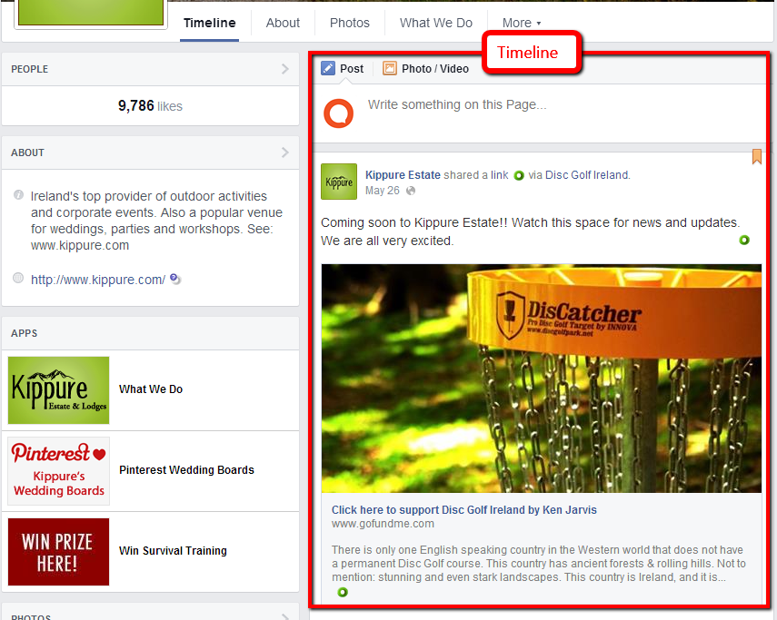
The Hovering Like Bar
In the old layout, a passive navigation bar that included a “like/liked” button would slip down from the top of your screen as you scrolled down the timeline of a business page. The problem is, it was always there regardless if the user was already a fan or not – as a result, this bar probably faded into obscurity for most users.
Facebook has revamped this gadget into a light-weight Like Bar that’s a bit more animated, hovering over the timeline column and only popping out if the user has not yet liked the page.
The bar also features a call to action to get users’ attention and encourage them to Like your page: “Get updates from [page] in your News Feed.””
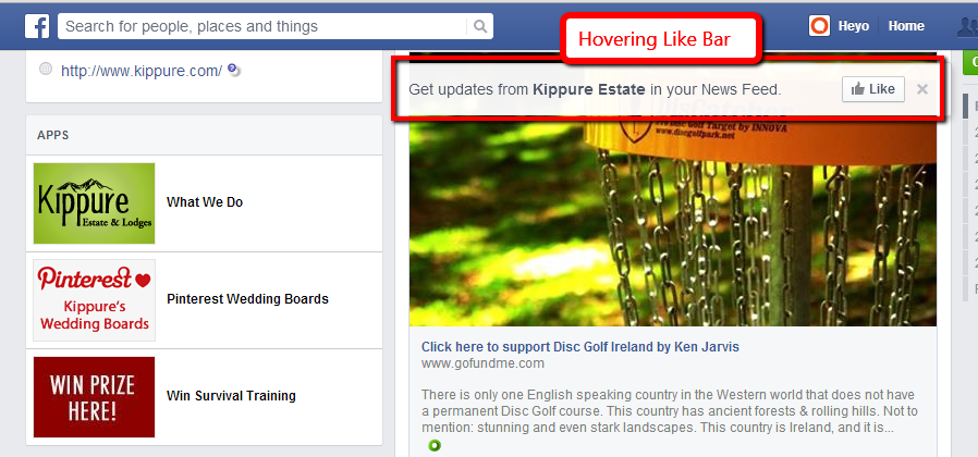
The Left-side Column
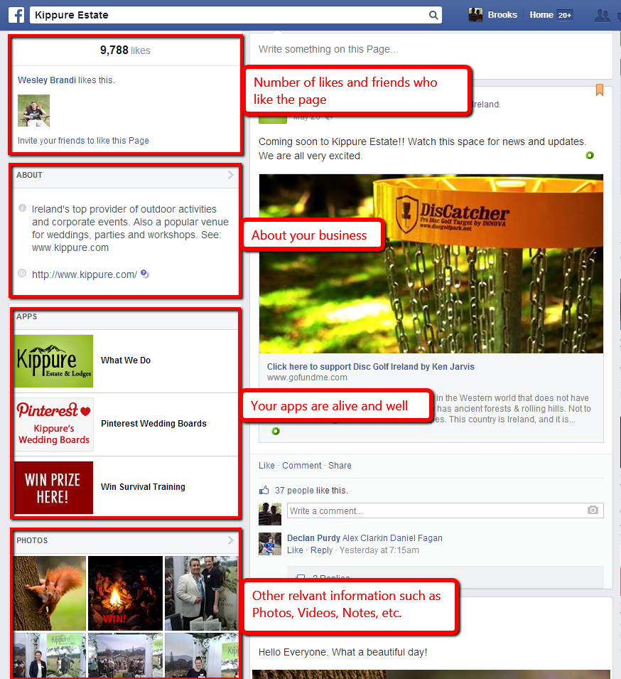
The information listed in the left-side column will vary slightly, depending on the type of business page. For instance, a brick-and-mortar location might have a map, address, visits, and hours of business, while a primarily online business might just have general information about the business.
Generally, the information listed in the left-side column will be similar for most businesses. That is, it will display number of Likes (and the user’s friends who like the page), an About section, Apps, Photos, Videos, Posts to Page, Notes, and whatever else may be relevant to your business.
It’s nice having a column dedicated to this information as it gives more room to preview the “about” information, photos, or videos that users used to have to click through to see.
The Top Navigation Bar
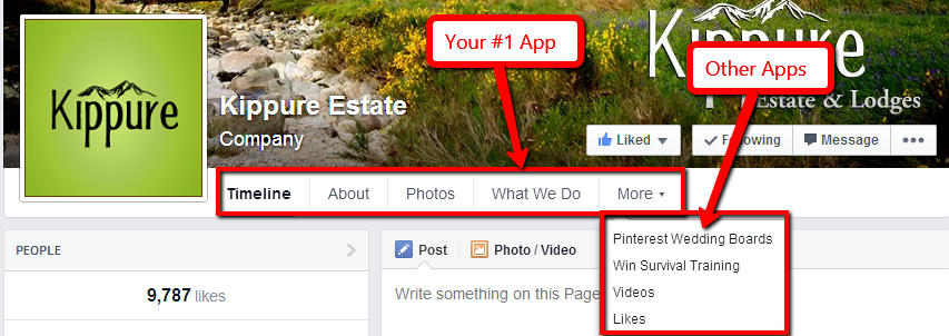
For those users less likely to scroll down and take a look at what’s on the left-side column, some of the more important features are doubled in the top navigation bar for quick and easy access, including your About section, your Photos, your top App, and a “More” drop-down menu that lists your other apps.
So don’t worry – your apps are accessible in multiple places!
While we’re here, it’s also worth noting that your Business avatar, name, and type have been shifted up into the cover photo along with the Like, Following, and Message bars. This mimics the look and feel of a personal profile page.
Admin Tools
The admin panel got a major overhaul as Facebook decided to simplify the interface and merge it with the cover photo. A much sleeker, light-weight interface has replaced the cluttered one of old.
The navigation bar to the top left gives you easy access to your activity/notifications, your insights, and your settings.
The “Build Audience” bar gives you direct access to your Ads Manager and Page Promotion features while the “This Week” bar on the left acts mainly as a Page Insights summary for your page – showing you your pages most important information at a glance.

Source: Facebook
Pages to Watch
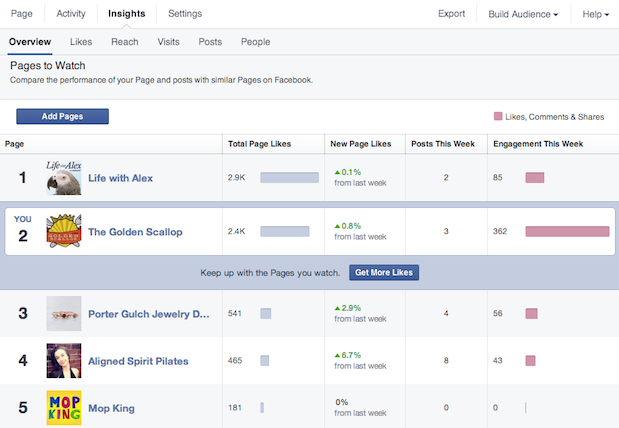
If you’ve ever been curious about how other pages are doing compared to your own (of course you have,) Facebook just made it a whole lot easier.
Packaged along with the new layout is a new Page Insights feature called “Pages to Watch.” With this you’ll be able to create a list of businesses you’re interested in and track their performance. You’ll get to see stats like “new page likes” and “engagement.” More specifically, you’ll get to see the most engaging posts of the past week put out by the pages you’re watching.
And in case your wondering, pages will know that someone has added them to a watch list but will not know who exactly added them.
Source: Facebook
Are you done waiting?
I’m sure you’re beyond ready and prepared for the switch. But you can never be too prepared! If you’re looking for that extra edge to drive engagement, email captures, and sales, click here to sign up, and we’ll show you how to launch a mobile optimized campaign that converts at 10% or higher whether you have the new or old layout!
Tell us what you think and we may quote you in a future article:
Have you been switched to Facebook’s new lay out? Were you switched to the new layout, then reverted back to the old one? Do you like the old lay out better? Leave your thoughts and questions in the comments below.