Page loading time depends on several factors. Some of these factors involve either the Internet connection speed, the devices you use or the elements that compose the website people are visiting. Whatever the cause is, it is your job as a web designer to do your best to keep your viewers’ attention.
How long users willing to wait for a site to load before they abandon the page sometimes depends on how you can entertain them while they are waiting. A great way to have their attention while the page is loading is to present an eye-catching loading page.
Here are some ideas and inspiration of loading effects that you can apply on your web design.

Have you seen a snail run really fast? You might have if you have seen Turbo, but if you haven’t yet want to see something like that again, better use this Helixbar on your site. It is an ultra-creative way of spicing up the waiting time for your website besides the snail gives it a different kick.
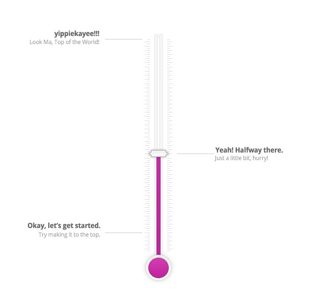
I personally hand-picked this one because it used creative captions to entertain the visitor while waiting for the whole site to load. Using totally witty, short-texts, this will truly turn the temperature up for your website. I just hope it reaches the boiling point and load the site before your temper does.
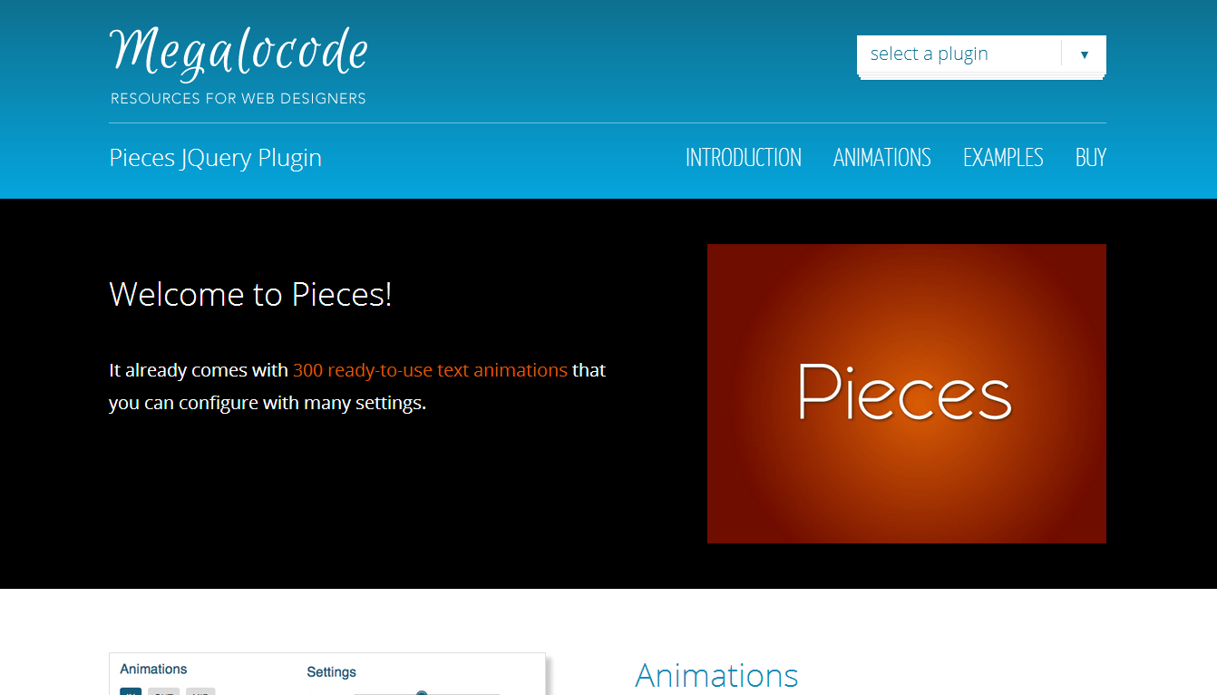
Pieces is a very creative yet simple loading plugin that allows you to choose from over 300 loading animations. You’ll see how your page is ripped out into something magical as your viewer awaits from some cool content from you!
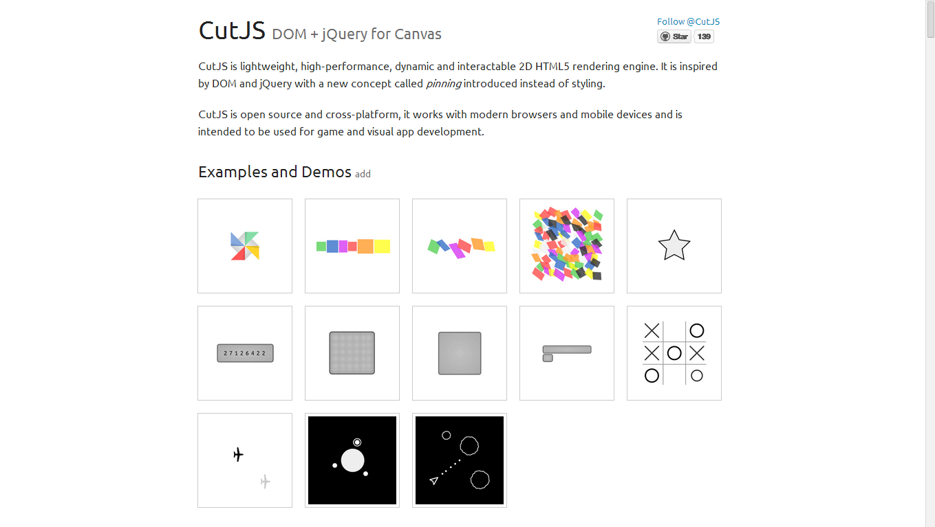
Using CutJs will allow you to include a playful mood in the design. With a color scheme same as Google, your loading screen will surely be as fun and reeking with googliness.
5. Loading animation by Joacim Nilsson
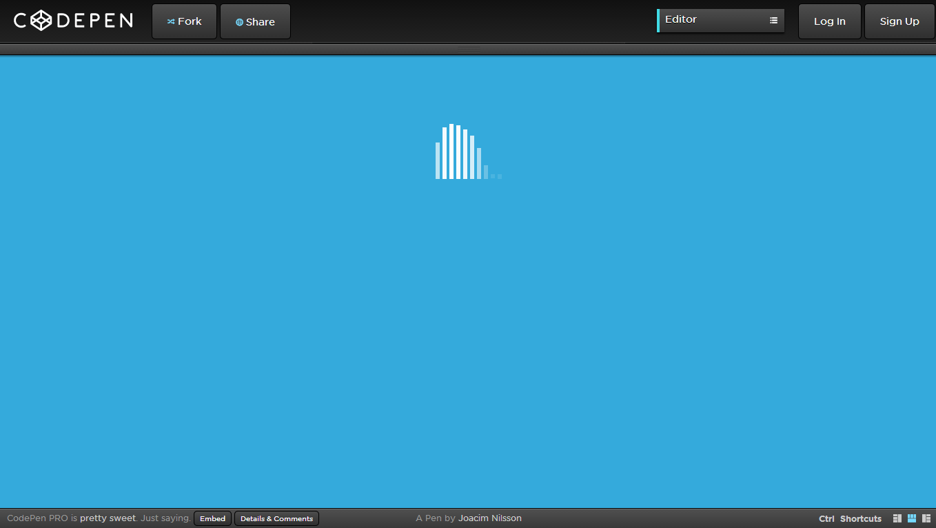
If you are looking for a loading animation that will give your website a unique vibe, this one is for you. With a loading effect that looks like the sound levels in your stereo, your website will never be looked the same.
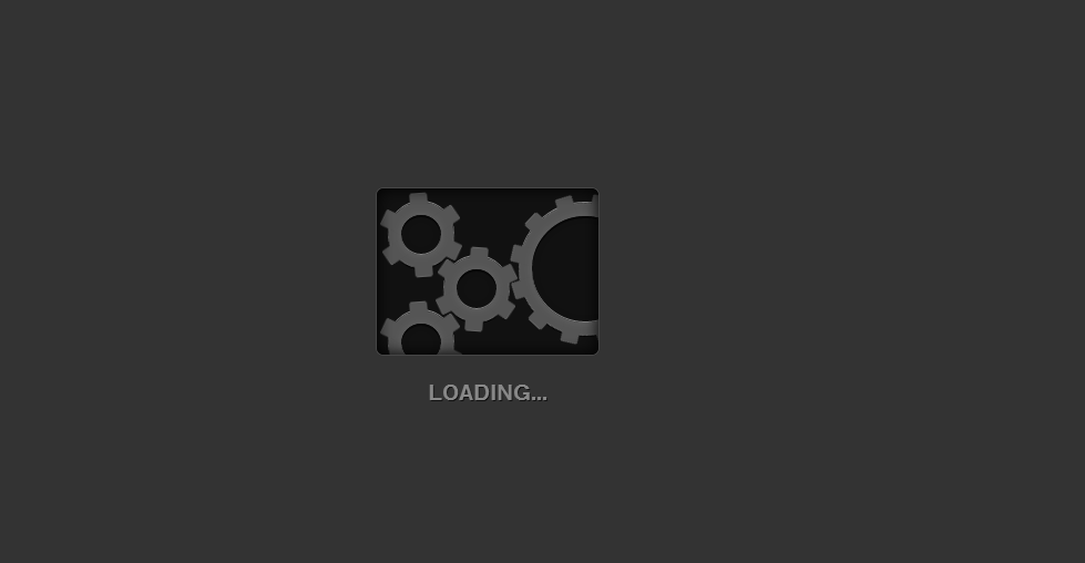
Gears! What way to illustrate movement. This loading effect surely fits for those who are designing websites for automotive companies and race-car games.
This is a cute animation that you can try to adapt on your website. Like the spinning loader effect, this also uses simple and yet creative typography combined with pastel colors. A simple rotating yet very entertaining loading effect.
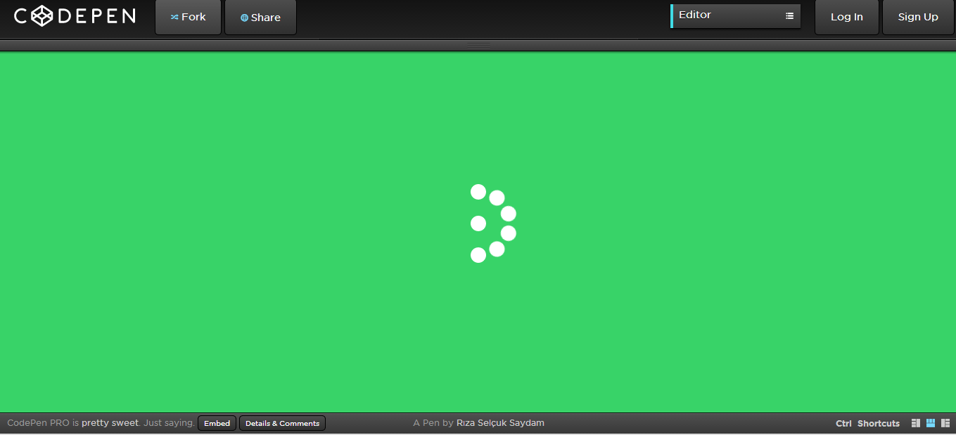
You may think this is just some lame rip-off of Windows 8’s loading icon. No, you’re mistaken. This is gives another touch to that animation.
Love the loading effect of Flickr.com? This is a replica of that loading effect! Include this and have the flickr-ish feel in your website!
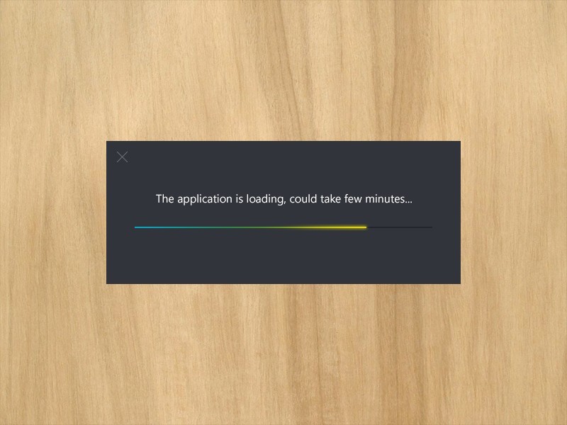
This is probably the simplest among the loading animations present in this list, but you won’t consider excluding this one out. Simple as it may seem to be, this animation will be effective as it looks simpler and faster to load than most animations out there.
Conclusion
You can always turn a boring horizontal loading effect into something that will “wow” your viewers. As a web designer, the power of creating a wow effect is always in your hands! You have to take time to do that. You need to exert a lot of effort and patience. But like these loading animations, you just have to work and wait. And eventually, something beautiful will unfold.